
2025-05-20
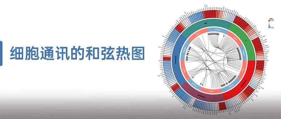
在单细胞转录组学分析中,细胞通讯分析以其直观且信息丰富的特点,成为研究人员探索细胞间相互作用的重要工具。为了进一步增强通讯热图的展示效果,我们重新对热图升级为如下图的细胞通讯和弦热图,充分展现了细胞间复杂而精妙的通讯网络。
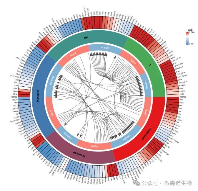
图1 细胞通讯和弦热图
图中展示了不同细胞类型间的受配体相互作用方向,受配体基因对以及其通讯概率。在绘图时,我们使用cellchat分析流程输出的通讯总表cellchat.Communication.net.xls作为输入文件,核心绘制代码示例如下:
1、最外圈
表示每个相互作用的配体-受体的基因的详细信息,基因通讯概率从 低到高对应的颜色由蓝到红;
circos.trackPlotRegion(ylim = c(0, 1), track.height = 0.15,
bg.border = 'black', bg.col = col_fun(plot_df$prob),
panel.fun = function(x, y) {
sector.index = get.cell.meta.data('sector.index')
xlim = get.cell.meta.data('xlim')
ylim = get.cell.meta.data('ylim')
} )
circos.axis(sector.index= plot_df[i,6], direction = "outside", labels=plot_df$gene[i],
labels.facing = "clockwise",labels.cex=.58, col = 'black',
minor.ticks=0, major.at=seq(1, length(plot_df$gene)))
此时我们会得到一个环形热图,如下。需要提醒一下,这里的通信概率仅代表交互强度,并不是确切的pvalue概率。
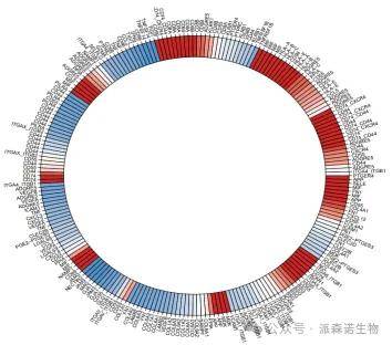
图2 最外层环形prob热图
2、第二圈
表示细胞类型,不同的细胞类型用不同的颜色表示;
circos.trackPlotRegion(
ylim = c(0, 1), track.height = 0.15, bg.border = NA,
panel.fun = function(x, y) {
sector.index = get.cell.meta.data('sector.index')
xlim = get.cell.meta.data('xlim')
ylim = get.cell.meta.data('ylim')
} )
for(my_type in sort(unique(plot_df$celltype))){
id_list = plot_df[which(plot_df$celltype == my_type),]$ID
highlight.sector(as.character(id_list), track.index = 2,
text = my_type, niceFacing = F, font = 2, col = color_pal[my_type])}
然后我们就把细胞类型的扇面添加到第二圈中
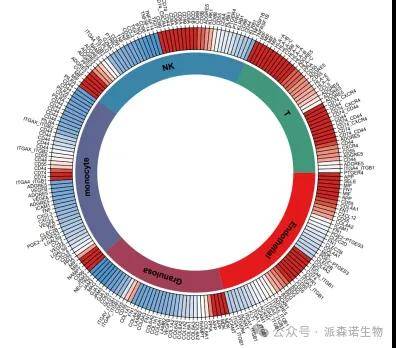
图3 第二层 细胞类型
3、第三圈
表示该细胞类型配体-受体基因对的类型和占比;
id_listL = plot_df[plot_df$LR == "ligand"),]$ID
id_listR = plot_df plot_df$LR == "receptor"),]$ID
highlight.sector(as.character(id_listL), track.index = 3,text = 'ligand', niceFacing = F,
col = '#FB8072',text.col = 'white')
highlight.sector(as.character(id_listR), track.index = 3,text = 'receptor', niceFacing = F,
col = '#80B1D3',text.col = 'white')
通过以上代码,我们在第三层增加受配体信息
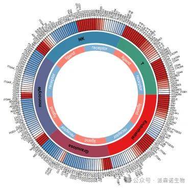
图4 第三层受配体信息
4、中心
线和箭头表示互作方向;
circos.link(sector.index1 = lrid[i,5], point1 = 0, sector.index2 = lrid[i,6],
point2 = 0 ,directional = 1,
lwd=1, col="grey30",lty=1)
lgd <- Legend(at = c(round(prob_pal[1],3),round(prob_pal[3],3)), col_fun = col_fun,
title_position = "topcenter",title = "prob")
draw(lgd, x = unit(0.96, "npc"), y = unit(0.8, "npc"))
最后,在中心添加受配体对的对应关系连线,以及右上角热图图例。
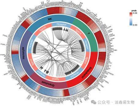
图5 受配体对应关系连线
细胞通讯和弦热图不仅是一张美观的热图,更是揭示细胞间信息交流的有效工具,让我们能够深入探索细胞世界的奥秘,揭示细胞间潜在的通讯途径。
绘制图片或者复现代码过程中老师也可以根据关注的信息自由选择展示内容,如果老师遇到疑惑,欢迎拨打我们的热线电话或者联系我们的驻地销售。